An Overview of Work
by
Notes from Below (@NotesFrom_Below)
March 21, 2023
Featured in The Class Composition Project (#16)
An overview of work and workers in Britain

inquiry
An Overview of Work
by
Notes from Below
/
March 21, 2023
in
The Class Composition Project
(#16)
An overview of work and workers in Britain
The Class Composition Project is a workers’ inquiry project. We believe that workers are best placed to explain what’s going on in their workplace, and that we can draw lessons from individual workers’ stories to understand what’s happening across the broader workforce. But to paint as full a picture as possible, we think it’s important to draw on all of the data available to us, including statistical data produced by the state.
The UK’s Office for National Statistics1 publishes many statistics that are helpful when trying to paint a picture of class composition. The ‘framework’ of statistics that they have developed is based on the concepts of labour supply and demand, in other words, the number of workers either in work or available to start work, versus the number of jobs that employers need to fill. Understanding the tension between labour supply and demand, whether across the whole economy, in specific industries and geographical areas, or at individual firms, is a crucial part of understanding the balance of class forces, and as workers, we need to get as good at understanding this as our bosses are.
The state of the labour market - the strength of the working class
In the year before the pandemic, there were more people in employment in Britain than there have been at any other time. And although the number of working people dropped by around 900,000 across 2020, by the second quarter of 2021, it had started to rise again, and is now close to the level we saw pre-pandemic. In the three months to April 2022, there were 32.7 million people in employment.
The number of unemployed people (defined as people looking for a job and available to start work) is sometimes called the ‘reserve army of labour’. It allows employers to respond to workers’ demands for better pay or working conditions with arguments like ‘If you don’t like it, there’s plenty of other people that would be happy to take your place’. The unemployment level in Britain was at its highest in 1984 when over 3.2 million people were unemployed. The level only dropped below 2 million in 1997, hovering between 1.4 and 1.7 million throughout the early 90’s and 2000’s, before beginning to rise again in 2008, and increasing above 2 million again in the last quarter of 2008.
There were 1.3 million unemployed people in the three months to April 2022. There were a few months pre-pandemic where figures just below 1.3 million were recorded, but other than that, there has not been a smaller number of unemployed people since the mid-70s. In other words, the ‘reserve army of labour’ is currently smaller than it has been at any time since the 1970s.
The threat of redundancy is another weapon in the armoury of employers seeking to hold down or cut terms and conditions of employment. There were 56,000 redundancies in the three months to April 2022. This is the lowest number of redundancies recorded since these figures started to be produced in 1995, and compares to highs of 311,000 in the three months to April 2009, and 402,000 in the three months to November 2020. In fact, redundancies have been at record low levels in each of the last 6 rolling 3-month reporting periods.
The number of vacancies across the economy is a further indicator of the bargaining power that workers might have relative to employers. Over the last 20 years, there have typically been between 400,000 and 800,000 vacancies at any time. In the three months to August 2020, the number of vacancies topped 1 million for the first time, and has continued to grow, reaching a record high of 1.3 million in the three months to May 2022, before declining very slightly in the three months to August. This means there are now the same number of unemployed people as there are vacancies. The highest number of vacancies in a single sector is in ‘human health and social work’ (215,000), followed by ‘accommodation and food service’ (174,000) and ‘Wholesale and retail trade’ (161,000).
Looking at vacancy data alone, workers in Britain are arguably in the strongest position relative to employers that they have been in for a very long time. The labour market as a whole is tight, with hundreds of thousands of jobs going unfilled across a range of sectors.
Employment by occupation - the shape of the working class
The employment data in the Labour Force Survey can be broken down by occupation (based on the Standard Occupational Classification 2010). We can use this to look at which individual job roles (occupations) are most common across Britain, and how this is changing over time.
The visualisation shows the top 20 occupations between 2005 and 2021, by the number of people that work in them across the whole of Britain broken down by 3-digit ‘Standard Occupational Classification’ codes (there is a more granular, 4-digit breakdown, but for the purposes of this analysis the 3-digit ‘codes’, also known as ‘minor units’, is sufficient.)
In 2005, the most common job group across Britain was ‘Sales Assistants and Retail Cashiers’, with 1.58 million people reporting that this was their main job. ‘Teaching and Educational Professionals’ was next, with 1.28 million people working in these roles, followed by ‘Secretarial and Related Occupations’ with 993,000 people.
By 2010, ‘Secretarial and Related Occupations’ had dropped down to number 9 in the rankings, with 200,000 fewer people working in these jobs, to be replaced in the third spot by ‘Caring Personal Services’ which rose by 175,000 over the same period.
By 2015, ‘Sales Assistants and Retail Cashiers’ had lost the top spot to ‘Teaching and Educational Professionals’ and two occupations that had hovered around the mid-point of the top 20 started rising up the list. The number of people working as ‘IT and Telecommunications Professionals’ increased by 203,000 in this five-year period, and the number of people working as ‘Functional Managers and Directors rose by 132,000, to see these two occupations claim the 6th and 7th spots respectively.
Five years later, by 2020, ‘Sales Assistants and Retail Cashiers’ dropped another place, now also sitting behind ‘Caring Personal Services’ which by now employed 1.4 million people. ‘Functional Managers and Directors’ and ‘IT and Telecommunications Professionals’ now occupied the fourth and fifth spots, with around 1.2 million employees in each of these types of roles. In 2021, ‘IT and Telecommunications Professionals’ continued to rise up the rankings, pushing ‘Sales Assistants and Retail Cashiers’ down into the fourth spot. We received enough responses to the Class Composition Project Workplace Survey to allow us to dedicate chapters of this first publication to some of these common areas of work, including healthcare, education, charities, and retail.
Interestingly, the jobs known as the 5 ‘Cs’ of low pay; cleaning, catering, cashiering, caring and clerical, are all in the top 20 most common occupations in Britain, which highlights their huge importance to the British economy. We’ll look at pay in more detail later in this chapter.
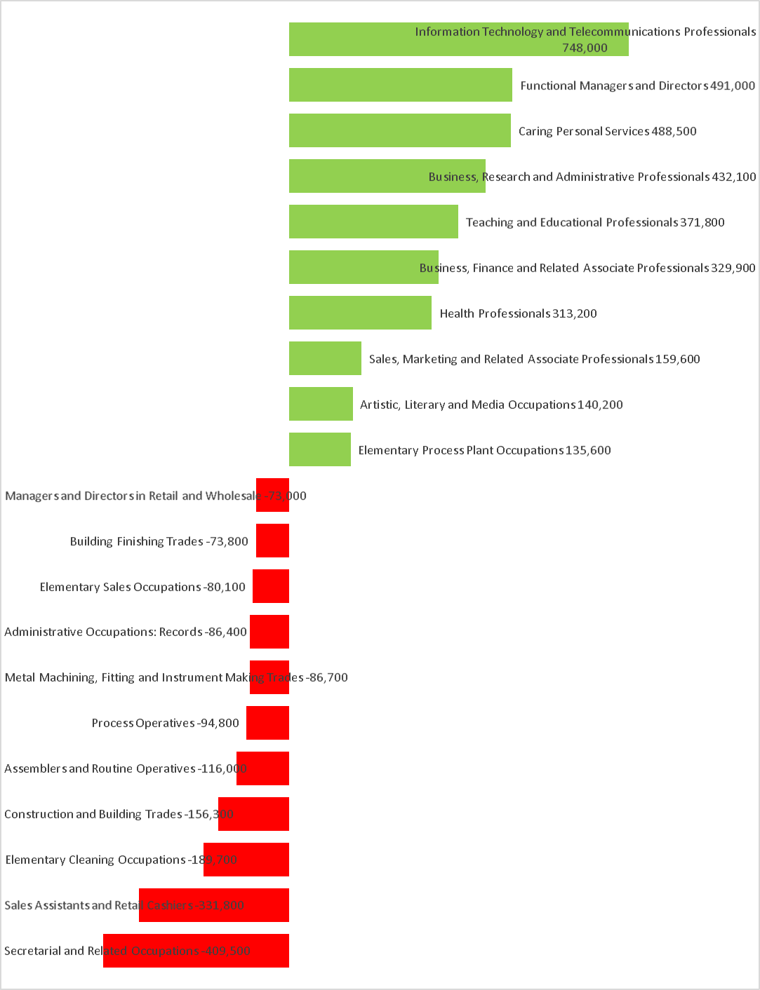
Largest rises and falls in employment by occupation
Another useful way of looking at this data is to look at the occupations that have seen most change between 2005 and today. The next graph shows the 10 occupations that have seen the biggest increase since 2005 and the 10 that have seen the biggest drops.
Employment by industry
The Office for National Statistics publishes a dataset called ‘Workforce Jobs’. This is different to the headline employment measure from the Labour Force Survey that we talked about earlier in the chapter, because it measures the number of jobs, rather than the number of people in employment. If someone has two jobs, they would only be counted once in the Labour Force Survey employment measure, while both jobs would be captured in the Workforce Jobs figures. The ‘employee jobs’ part of Workforce Jobs estimates are taken from employer surveys, and so they are seen as a more reliable measure of jobs by industry than the Labour Force Survey, which is a survey of individuals. Data is available back to 1981, which means we can use this measure to look at changes in employment by industry over the last 40 years.
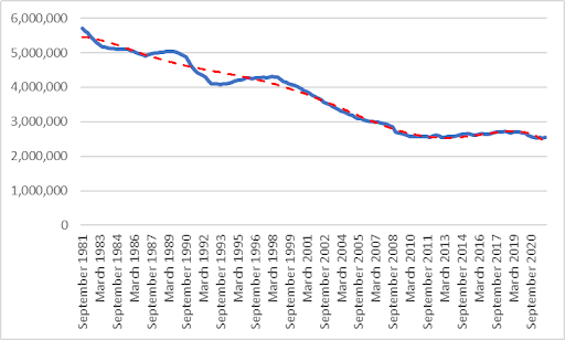
The visualisation below shows workforce jobs for the whole of Britain broken down by the main ‘Sections’ in the UK Standard Industrial Classification (2007). It shows this data for every calendar quarter from the middle of 1981 to the end of 2021.
In the earliest graph, for 1981, the largest concentration of jobs (5.7 million jobs) was in manufacturing. By the first quarter of 1991, the number of manufacturing jobs had dropped to 4.6 million, and by the second quarter it had dropped by an additional 100,000 and fell into second place, behind retail and wholesale, as the largest industry by number of jobs. The decline in manufacturing jobs continued over the next 10 years, and by the first quarter of 2001 was down to 3.9 million, now significantly behind retail and wholesale, which increased to just under 5 million in the same period. A few years later, in the first quarter of 2004, manufacturing would drop another place, behind ‘human health and social work’, where jobs had increased from 2.1 million in 1981 to just under 3.4 million.
In the first 10 years of the 21st century, manufacturing jobs continued to decline rapidly, and by 2011, they were hovering around the 2.5 million mark, behind retail and wholesale (4.8 million), human health and social work (4 million) and education (2.8 million). In the last 10 years, manufacturing jobs have held steady at around the 2.5 million mark, but have been overtaken by growth in jobs in ‘professional, scientific and technical’ and ‘administrative and support services’, each of which now account for over 3 million jobs, to sit in sixth place.
Interestingly, manufacturing jobs have declined more rapidly over this period under New Labour than they have under the Conservative governments that came before or since. The data starts in September 1981, and between this period and June 1997 (16 years) the number of manufacturing jobs fell by 1.43 million. In the New Labour years from June 1997 to June 20102 (13 years) the number of manufacturing jobs fell by 1.71 million. The fluctuations during this time were not linear (there were some rises and falls and some years saw much more change than others), but on average, manufacturing jobs declined by 89,000 per year under the Conservatives, compared to 132,000 per year under New Labour. Interestingly, since New Labour lost power in 2010, the number of manufacturing jobs has stabilised, as shown by the dotted trendline on the graph. The point we’re making is not that workers are better off under the Conservatives, but that the assumption that they are better off under Labour is also incorrect.
Regional employment by industry
The Workforce Jobs figures are also available broken down by region, which allows us to see where particular industries may have a particular importance in one region compared to another.
The visualisation below show Workforce Jobs broken down by the same industrial ‘Sections’ as the previous graph, but this time they are shown for each region of Britain in the last quarter of 2021. The graph below allows you to zoom into one specific region or to compare two or more regions side by side.
A cursory look at these visuals shows that London and the South East have the largest numbers of jobs overall, but behind those headline figures there are some interesting stories at the level of individual regions. For example, in five regions, ‘human health and social work’ is the largest industry by number of jobs - these are the North East, the North of Ireland, Scotland, Wales and Yorkshire and the Humber. London is the only region with more jobs in ‘professional, scientific and technical’ activities than any other industry. In the other six regions, ‘retail and wholesale’ comes top.
In the North of Ireland, Wales and Yorkshire and the Humber, manufacturing is still the third largest industry by number of jobs, but the largest concentration of manufacturing jobs by region is in the North West. By contrast in London, manufacturing jobs are down in 14th place, with only 5,000 more manufacturing jobs in the capital than there are jobs in ‘real estate’. Information and communication jobs are particularly important in London, where this is the fifth largest industry in terms of jobs, ahead of education. The biggest concentration of construction jobs is in the South East, with 358,000 jobs compared to London’s 277,000.
The most granular breakdowns of employment by industry and geography are available in a different dataset, the Business Register and Employment Survey. This and other labour market data is available on the Office for National Statistics Nomis website.
Pay and inflation
Inflation is the increase in prices over time. Rates are measured by repeatedly measuring the prices of a series of commodities and tracking changes. A recession is a period of economic contraction, defined as two consecutive quarters of negative growth. Right now, the working class in Britain is experiencing the painful effects of inflation, and a recession is almost certain to follow.
Over the course of this inquiry, inflation has accelerated rapidly. The Retail Price Index has increased from 1.9% in the twelve months to July 2020 to 12.3% in the twelve months to July 2022. If wages do not rise at a rate faster than inflation, then workers get a real terms pay cut as their purchasing power falls. The decade between the financial crash of 2008 and 2020 saw real pay across the economy fall sharply and then very slowly recover to their previous level - before another sharp fall and rebound during the Covid-19 pandemic. Consistently rising real wages were a fundamental part of the social contract offered to the workers of the global north in the 20th century, but this now seems a very remote possibility for their contemporaries today. Now, however, rapidly increasing inflation threatens to not just stygmy real wage growth, but dramatically reduce incomes. According to Bank of England projections, in late 2022 wages are set to plunge by 8% in real terms. This will initiate a recession, as consumption falls across the economy.
Inflation is being driven by two interrelated forces: increasing costs as a result of exogenous shocks, and price gouging by fractions of capital which can take advantage of the bottlenecks these shocks create. Capitalism is fundamentally an unstable system. For centuries now, its laws of development have combined with a generalised lack of planning to create crisis after crisis: from imperialist wars to short-term economic crashes, famines and pandemics. This instability is particularly evident now, as we hurtle into an era of climate collapse. Our society faces a multitude of related threats, nearly all of which have the potential to increase the costs of production: habitation destruction is leading to the increased development and spread of zoonotic diseases, creating the potential for new global pandemics; regular heatwaves are leading to increasing energy use and collapsing agricultural yields; widespread flooding destroys infrastructure and livestock. At the same time as these shocks proliferate, multipolar geopolitics is leading to competing imperialist powers attempting to destabilise one another. The economy which is attempting to absorb these shocks and interruptions has also changed profoundly over the last 50 years. Supply chains have been both expanded globally and stripped of any excess capacity in the pursuit of leanness, and production itself has been reorientated so that commodities arrive on the market ‘just in time.’
These trends have, as the Covid-19 pandemic demonstrated, stripped away the safety margins from much economic activity and led to a substantial increase in overall vulnerability. When interruptions do occur the disruption is significant, and this offers well-placed fractions of capital to gouge prices. Oil and gas companies, for instance, have capitalised on the war in Ukraine and the resulting disruption of European gas supplies to post superprofits. The conventional wisdom that blames inflation on workers demanding increased wages clearly cannot apply to our situation. Despite a tight labour market, which would be expected to lead to upwards pressure on wages, the opposite is in fact occurring.
Given that we have no recent frame of reference for how the government of a global north economy can attempt to manage the combination of high inflation and a tight labour market, it’s useful to look back in time for historical precedents in order to add some context. In particular, we are interested in the circumstances that faced the first Thatcher government on winning the 1979 election.
Monetarism, the name given to the economic doctrine closely associated with the early years of Thatcherism, was aggressively opposed to inflation which it perceived as undermining market confidence in ‘sound money.’ The monetarist’s diagnosis of the inflation that emerged in the 1970s was that it was primarily caused by the Keynesian post-war approach to government intervention that favoured the creation of full employment and the stimulation of economic demand through government intervention. Associated with this school of thought was the idea of a ‘wage-price spiral,’ whereby inflation is driven by workers’ opposition to real wage cuts.
On a policy level, monetarists were willing to provoke an extremely deep recession with severe unemployment if the contraction in the money supply associated with rising interest rates could reduce inflation to near-zero. In the first two years of her government, Thatcher attempted to implement these ideas straight out of the box, and these decisions interacted with a global economic contraction originating in oil price rises to produce a catastrophic recession. In order to make massive cuts to the public sector, Thatcher’s monetarist policies suspended well-established managerial and planning apparatuses,3 helping set the stage for the lean economy that predominates today in the process. Unemployment skyrocketed and deindustrialisation accelerated, decomposing the forms of working class power that had been generated over the post-war boom. This economic assault on workers was combined with a more literal one led by the repressive arm of the state in line with the Ridley Plan (a premeditated approach to smashing British trade unions conceived of in 1977 and implemented post Tory victory in 1979,) culminating in the 1984-85 miners’ strike. Alongside tax cuts which increased the bounty offered to owners of capital by the successful exploitation of labour-power, and a transformation in the state centred on reductions in public spending, the social and technical composition of the pre- and post-Thatcher working class was almost unrecognisable.
Today’s circumstances are dramatically different. A ‘wage price spiral’ is now a manifestly unconvincing explanation for rising inflation, and there is no Keynesian excess to correct. Our tight labour market is a result of repressive migration policies and an ageing population, not a labour-capital settlement. However, the threat of rising interest rates leading to a deep recession, widespread unemployment and the acceleration of existing decompositional trends is still very real. In this sense, whilst the causes of our current situation differ, the decompositional threats of the current crisis to the working-class echo those described by Mario Montano in 1975:
The ‘energy crisis’ uniquely meets the requirements of capital’s strategy for the crisis. (1) The energy crisis reduces total employment; (2) it increases the threat of unemployment, both generally and in selected sectors; (3) it allows capital to be accumulated en masse through huge price increases in those very sectors (energy and food) that are dominated by the most powerful capitalists.4
Since the peak of British trade union membership in 1979, we have seen a long-term decline in working class power. Now, this waning workers’ movement faces a huge challenge: to defend workers against falling real wages, in the midst of a contracting economy. There is significant potential for these inflationary pressures to remain high, even after this cycle. It seems sensible, to assume, in line with James Meadway, that ecological decay will continue to produce intensifying supply shocks for the foreseeable future in a way which challenges the paradigm of conventional bourgeois economics.
-
We have used “Britain” throughout, but have used “UK” when referring to statistics that use the UK. ↩
-
New Labour lost office in May 2010, but the data is quarterly to June. ↩
-
Clarke, S. Keynesianism, Monetarism and the Crisis of the State. (Aldershot: Edward Elgar Publishing Ltd, 1988). ↩
-
Montano, M. (1975) ‘Notes on the International Crisis’, Zerowork #1. ↩
Featured in The Class Composition Project (#16)
author
Notes from Below (@NotesFrom_Below)
Subscribe to Notes from Below
Subscribe now to Notes from Below, and get our print issues sent to your front door three times a year. For every subscriber, we’re also able to print a load of free copies to hand out in workplaces, neighbourhoods, prisons and picket lines. Can you subscribe now and support us in spreading Marxist ideas in the workplace?
Read next

Initial Findings of the Class Composition Project
by
Notes from Below
/
March 21, 2023